
Here's the North American box art for Mario Strikers Charged.
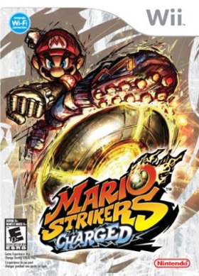
Mario Strikers Charged US box


Wizpig 64 said:
Yeah. Uh huh. You know what it is. Pooping niggers, pooping niggers, pooping niggers, pooping niggers.
Yeah. Uh huh. ... Star Fox 64
tonysburger said:
you could probably learn how to make a waffle maker in there ...
T3Knyne said:
Ts university tuff ...
spleefian said:
acting like this is even active at all but i just really dislike it sideways because to me it just looks incomplete ...
spleefian said:
seeing literally just "1 decade ago" is scary to me like id be used to it saying you know 12 or 13 years ago but just ...
![]() © 2006-2026 | Privacy Policy
© 2006-2026 | Privacy Policy
Wii's World is not officially affiliated with Nintendo! (but they wish we were).

 Formula Bit Racing DX trailer
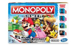 Monopoly Gamer Edition Review
User comments
Wii Freak said:
I liked the other one.
Orez said:
Nice.
Gonzo said:
Yea, I agree with Wii Freak. The other had a lot of other characters on the cover, and the characters took up the whole box, which makes it better. He's really only in the middle of the box. I see the Wi-Fi!
Scooby Jew said:
It'll do.
Yoshi-1up said:
Not bad!
BrothaZ said:
What was the other one, and what's wrong with this one? It's tight!
Andrew said:
The Australian one is way better than this phony baloney.
Wii Freak said:
This cover is just too plain.
smash fan x said:
It's so dark, and how does he bend that way?
me said:
Not as good as the UK box art.
eric ♥ wii said:
Yay! Wi-fi!
dont dis the wii said:
The covers are so different than other mario games. I think the mario sports aren't that good.
Chaos said:
The box art for most games in the other regions usually tend to be better looking. Why is that?
brett said:
Australian cover better.
wii senators rule said:
The uk box art is 10 times better than this one.